ColdBrewed Creative

Logo + Visual Identity for a Phoenix-Based Photography Brand

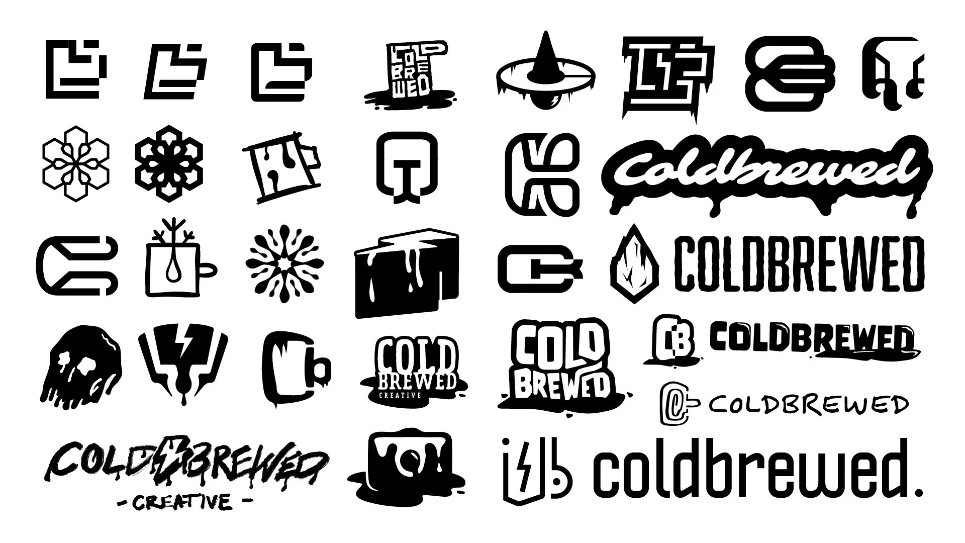
Logo design for a growing photography brand rooted in raw expression, artistic connection, and a strong sense of local identity. Based in Phoenix, Arizona, Coldbrewed Creative reflects the contrasting nature of its name—cold and brewed—through bold visual elements: smooth meets sharp, heat meets chill. The logo uses swirling positive and negative space to echo the motion of cream blending into cold brew coffee, symbolizing creative transformation. Designed to be versatile and distinctive, the mark supports two unique Instagram platforms, including ColdbrewedMugs—a striking black-and-white portrait series. More than just a brand, it’s the start of a Phoenix-based creative community built around honesty, craft, and collaboration.

Brewing the Brand

  • The Roast

    When I first got the project, it was simply called ColdBrewed, with the prompt to “go wild.” I leaned into contrast — hot vs cold, smooth vs bold, energy vs chill.

    Visual inspiration came from drips, melting forms, ice, and lightning bolts — all symbols of movement, clarity, and creative energy. I also explored the C and B letterforms, experimenting with shape, interaction, and hidden meaning.

    These early directions brewed the foundation. While the final identity took a different turn, the energy and intent remained at the core.

  • The Last Drop

    After presenting the initial concepts, the bold, melting direction stood out — but the brand needed to shift toward what it truly was becoming: a photography and video studio.

    Inspired by that pivot, I explored using positive and negative space to form a camera silhouette. The mark drew from the visuals of cream swirling into coffee, blending motion with structure, and melting into shape.

    It was one of those moments where everything just clicked — the concept and purpose aligned, and the brand finally felt like itself.

  • The Buzz

    To show how the ColdBrewed Creative identity performs out in the real world, I captured its current presence across social platforms. These screenshots highlight how the brand comes to life in context — clean, bold, and rooted in creative energy.

    From profile icons to content layouts, the visuals stay true to the identity’s core: strong contrast, expressive visuals, and a clear point of view. It’s a brand that doesn’t just look good in a style guide — it holds up in fast-moving, scrollable environments.

Previous
Previous

All-Terrain, All Together

Next
Next

Black Mesa Outdoors